Children’s Museum of Denver
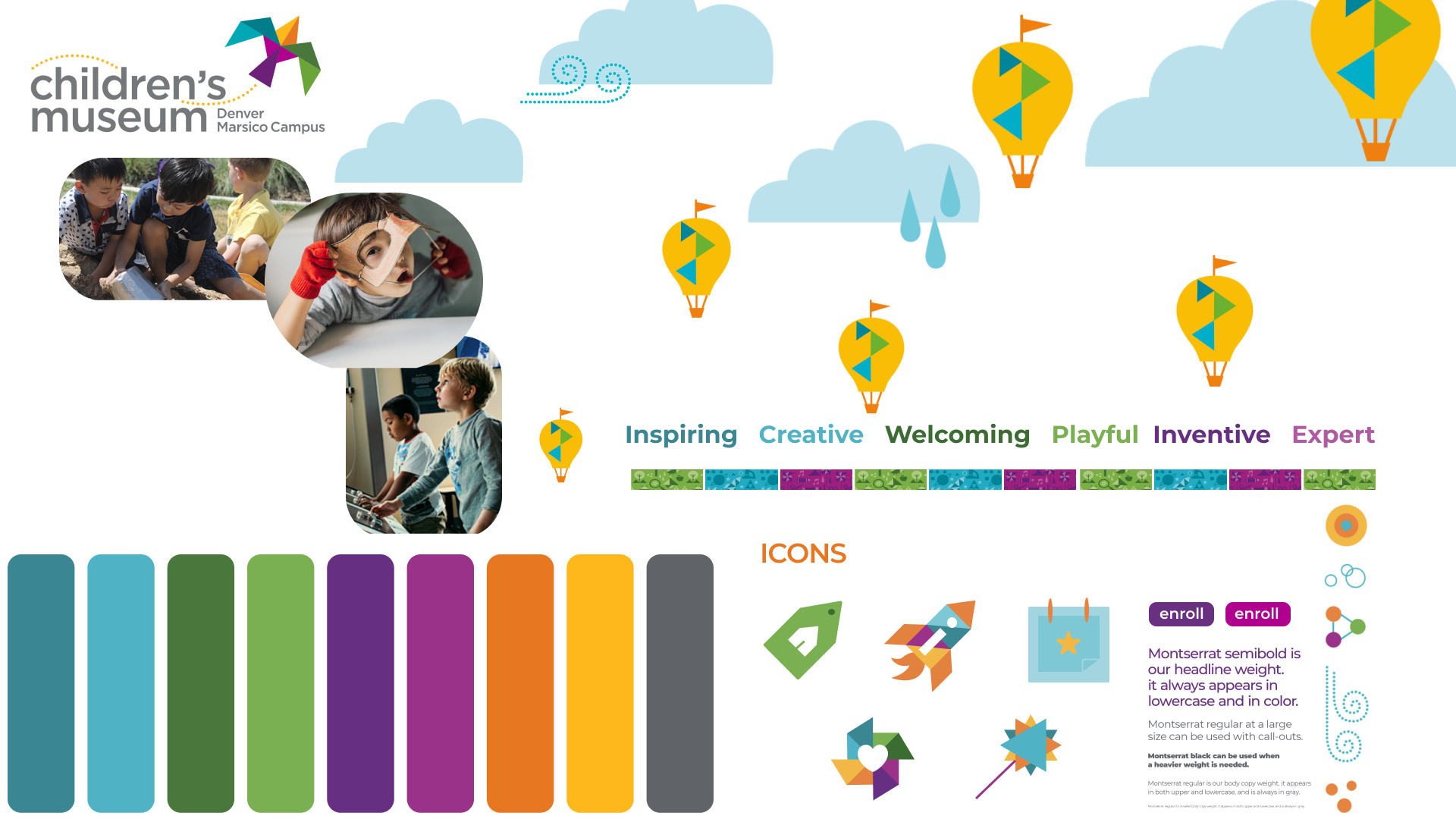
The design of the app should reflect the brand's personality, color palette, photography, textures and content while meeting the needs of the target audience. This includes school teachers, families with children and museum members who should feel the brand's professionalism, concept and personality through the app.
Skills
Brand analysis
Comparative analysis
Sketching Style Guide Design
Icon Design
User Interface (UI) Design
Wireframing
Tools
Figma
Project Timeline
Feb2023-Mar2023 (4 weeks)
Program and Role
California College of the Arts
Interaction Design | Visual Design | Professor Roderick Lemaire
Merma Ma (UI Design)
Introduction
The Children's Museum of Denver, embodies its vibrant educational mission through a fully rendered website. Rooted in the museum's established visual identity, the project aims to create an engaging and accessible online interface that meets the diverse needs of its audience (children, families, educators, and community members). The goal was to create visual interface use their brand and support their unique mission.
Target Audience
Brand Positioning
The Children's Museum in Colorado is the home for activating creativity and passion for learning.Expertly designed kid-powered learning environment for our community’s youngest children and their caregivers.
Brand Value Proposition
Center that inspires the imaginative and inventive spirit in all of Colorado's kids. Cherish it as a hub of exploration, creativity, inquisitive learning and it also fosters children' curiosity.
Brand Personality
Inspiring
Creative
Welcoming
Playful
Inventive
Expert
Brand analysis
The brand analysis for the Children's Museum of Denver showcases a playful and educational brand identity that is communicated through a vibrant, child-friendly website. The museum presents its core values of learning through play by offering a variety of programs such as Educational Outreach and Virtual Educational Experiences. These programs are depicted with engaging visuals like bright colors, animations, and photos that convey a sense of creativity and excitement. The brand positioning is unique, emphasizing the educational value of play and exploration, and is designed to evoke positive emotions, making the museum an appealing destination for children and their families. The overall visual and emotional branding is focused on creating an interactive experience that highlights the joy of learning through play.
Competitive analysis
The comparative analysis of the National Children's Museum and the Bay Area Discovery Museum reveals distinct approaches to engaging with their audience through their online presence. The National Children's Museum's website emphasizes inspiration for children to change the world, valuing curiosity, passion, and inclusivity with a unique focus on bridging STEAM educational gaps through both on-site and virtual learning. Their brand personality comes across as wondrous, whimsical, playful, and inspirational, aiming to evoke passion and enthusiasm in users. In contrast, the Bay Area Discovery Museum focuses on providing high-quality, research-backed early learning experiences, believing this to be the key to children's success and society's investment. Their brand personality is passionate, inspiring, creative, and welcoming, positioning the website as trustworthy, professional, inclusive, and diverse. Both institutions showcase their commitment to child education but with slightly different emphases on how they achieve this goal and present themselves to the public.
Stile Tile
Sketches & Final Icon
Building on the basic branding elements and styles, an icon exploration phase was initiated with a focus on designing unique icons for the navigation bar. Brainstorming took place and a quick sketching session was initiated with the goal of designing icons for the navigation bar for different interfaces in less than a minute. A series of different icons were created, each reflecting the essence of the museum's brand while providing intuitive navigation cues for users. After the session, the sketches were shown to others for feedback and preferences to determine the most resonant and effective icons. The most popular icons were then refined to ensure that the visual language not only aligned with the Children's Museum of Denver's identity, but also enhanced the user experience through clarity and a sense of exploration.
Wireframe&Final Screen
The design should be simple, consistent and clear is an interface that is easy to navigate and understand.
The design should be attractive and consistent with the overall brand or product design also should help.
All text should be easy to read and buttons and icons should be clear and easy to understand.
The style and elements should be consistent: (if the pages are all at sharp angles then there should be no rounded angles)


